


Top 10 Netflix movies - and their photography
- Maria Cocu

- 11 dic 2020
- 3 min de lectura
As Wikipedia says: "The traditional 7 subdivision of the Arts, being Architecture, Sculpture, Painting, Literature, Music, Performing, and Film stories" , and since this is an art blog, i feel the prevailing need to cover all these types of art. So far I've talked about painting, sculpture and performing. I'll make you guess what subdivision of arts is this one about
Netflix just unveiled it's "Top 10" feature so I am going to unveil the meaning of the movie posters they used. Oh and by the way, Netflix, if you see this I'm open to sponsorship ;)
10. Mank
The new film from David Fincher tells the true story of how Herman J. Mankiewicz wrote the first draft of Citizen Kane, also delving into his career in 1930s Hollywood that inspired the script.

A slightly blurred image of an middle age man makes for this movie's poster. Eyes fixed on something - makes you wonder on what. The black and white colors, Nadir light and added numbers send and intriguing feeling. B&W colors weren't purposely chosen of course, the movie is very old. But adds a nice touch!
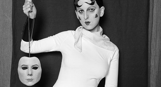
9. Hillbilly Elegy
Based on the memoir of the same name, the film recounts the upbringing of J.D. Vance in rural Kentucky and the familial struggles of his unstable mother.

Doesn't this image make you feel unconfortable? Cause i feel awkward. Because of mainly 2 things: the judgemental look and the framing. In most proffesional photos, the photographer follows a grid to position the models. In this case, the woman's head on the right should be positioned lower and more to the left, where the lines cross. These intersections mark the spectator's focus.

So how could Netflix miss on something so basic, you wonder.
They didn't. This is how they positioned the image on their webpage:

Your brain automatically erases the black part of the whole page and the framing works now just perfect. Good job Netflix.
8. The Christmas Chronicles
When Santa (Kurt Russell) gets stranded on Christmas Eve thanks to the meddling of two quarreling siblings (Darby Camp and Judah Lewis), the three must work together to get Christmas back on track before the night is over.

The first thing that striked me about this poster is the color and brightness choice - completely opposed to the pallette normally used.

The editor's logic must have worked something like this:
"I'm a digital editor and my photography knowledge tells me to add brightness and sparkles and joy and warm colors. Oh wait I work at Nefltix. Nevermind. I must make this image stand out, even if it's by an unorthodox artistic styling. "
Does it work? Idk
7. Captain Underpants: Merry Blissmas
I'll just skip this one. I don't know much about cartoons, nor does it fit this entry's topic.

6. The 2nd
A secret service agent finds himself drawn into a terrorist plot in which he must protect and save the daughter of a Supreme Court justice.

The Typical American Movie, with the typical movie poster. It states very clear for whom this movie is for: if you like movies with action, family values and spies, watch it. Netflix got your back!
Agressive diagonal lines are used for indicating action and movement in general. They call for violence. Russians created their own style using mainly this resource, and it's called Russian Constructivism. Notice how eye catching it is. Red + B&W also adds to the agressivity, due to contrast and fully saturated colors.


The number 2 (Movie Title: 2nd) would have fit so much better with a fully saturated red, which would also simulate blood.
Then why did they choose yellow?
Because it would be too similar to Russian Constructivism (remember, you must be a good russian hating american watching a nice american movie on your american platform, Netflix). It also does not interfere with the American flag, placed down to the right.
If you liked this post and want to know what's behind the best 5 movies' posters on Netflix' Top 10, subscribe to my blog and I'll send it to you 😉


Comentarios